Oh hey, I have a blog or something! Let's update it, shall we?
Mostly just been doing work stuff at Sony, which I can't really talk about because NDA and all that fun stuff. But back in August I had some free time, so I entered the 11 Second Club again to see if I'd improved since the last time (man, it would be sad if I hadn't gotten any better, wouldn't it?).
Good news, I've improved! I managed to earn first place and got myself a critique from Animation Mentor Nicole Herr. It's always great to get extra feedback and I took one more pass at the shot to try to incorporate her notes before adding it to my reel.
Anyway, I figured for my blog I would post a little behind-the-scenes video showing some of the steps I went through to take the shot from idea to final product. I know there are plenty of these types of videos floating around, but hey, why not join in the fun? Breaking it down also helps me understand my own process better, so I can continue to refine it further as I keep learning and pushing myself.
Step 1: Listen to audio line. A LOT.
Part of the fun of the 11 Second Club is coming up with a story to match the audio that they provide each month. I loved that the woman sounded like she was about to cry as she delivered her line. I wanted to try to capture that moment. The word "guidebook" is not something you would really use in ordinary conversation, so I pictured them on vacation where something had gone sour, and the man might be staring at things scattered around the room - maps, itineraries, plane tickets, guidebooks... meanwhile she is packing to leave early.
Step 2: Initial Cloth Test, or... "Can I really do this?"
Once I had an idea in my head, I had to see if I could actually animate someone packing things in a suitcase. I'd done a few experiments with nCloth in Maya before, but nothing too fancy. This test gave me the confidence that I could pull it off.
Step 3: Reference footage, a.k.a. Me making a fool out of myself
I couldn't convince my husband to get in front of a camera, so I ended up shooting myself both as the man and the woman. I'm not the best actor, so it usually requires several takes mish-mashed together into the performance I want. Even after editing, I keep a couple variations handy in case I change my mind about certain acting choices.
I also look a lot of reference from movies where actors are doing similar things. For this one, I studied a lot of "break-up" scenes. :)
Step 4: Layout
This is kind of a nebulous phase for me; I've seen "layouts" in other people's projects that are just characters in T-poses sliding around the scene. I personally prefer to have at least the main key poses of the characters in place, in order to frame the shot more clearly. So "layout" for me also includes keyframe blocking. In this phase I had the woman turn around to look at the man... but later decided it was a bit too melodramatic. You may notice that the woman's final pose and eyelines change quite a few times throughout the process.
Step 5: Breakdowns
It may not look like much has happened here, but this is where a lot of grunt work takes place defining the motion of the characters and getting the timing down. I'm basically adding in more poses between the key poses that "break down" the action into bits and pieces that will help me keep control over the animation once I get into the phase of turning on spline tangents.
Step 6: Initial facial pass
This is another point of contention among animators - I've heard some people say "don't animate the face at all until the body is completely working." I've heard other people say "start with the face, because it's where the audience looks first." I take a middle road; I'll get the body working up to a point, then focus on making sure the face reads well before getting into splines.
Step 7: Splining
This is the most time-consuming phase for me. Transitioning from stepped keys to splined keys has never come easily; I always feel like I'm fighting the computer to get what I want. But it's also the part where the characters finally feel alive in the world, which is cool! Turning on splines instantly reveals problem areas with weight and timing, so I try to slide keys around just after changing tangents, to fix as much as I can before adding more in-betweens. It's much harder to change things once you start getting into polish, so the earlier you can spot mistakes the better. I usually spline in chunks, anywhere from 10 to 60 frames at a time depending on how much action is taking place.
Step 8: Polish
I should have talked about this earlier, but at almost every stage starting with layout, I try to get feedback from other people. How does the shot read? What do you think the characters are feeling? Can you tell what they're supposed to be doing? What isn't working? Getting fresh eyes on your work is essential! Early on, it's important to see if your acting choices are clear, making macro decisions about placement and posing. In the polish phase it's about the micro decisions, and feedback is about getting those final touches of icing on the cake, the little things that take your shot from "good" to "great."
I'm fairly happy with how the shot turned out, though of course there are always things that could be better. But at a certain point I have to stop noodling and move onto something new! Now what will that be...?
Saturday, November 16, 2013

Tuesday, July 30, 2013
Lightspeed!

Since I had so much fun with the Father's Day diorama, I thought I'd try a little more photography magic for Tommy's birthday card, this time with a couple of his toys. This time, Photoshop was used sparingly, only for a little color correction, wire removal, and addition of the thruster glow on the X-wing. The streaky star lightspeed effect was done in camera! And if you're wondering how, you can check out my Flickr set below, complete with behind the scenes commentary if you fullscreen it and click "Show Info." Enjoy! :)
Sunday, June 16, 2013
Father's Day diorama
Thought I'd try something a little different for this year's Father's Day card - a blend of traditional mixed media and Photoshop detailing. Overall I'm fairly happy with how it turned out, and considering it was a pretty rushed job, I think I can do much better next time I go this route. Making proper armatures, for one thing. The littlest fox kept tipping over backwards.
If you don't want to sit through the WIP slideshow, you can skip ahead the finished product:

Monday, April 08, 2013
Batman's birthday party

Someday I should learn to draw with some kind of vector-based software such as Illustrator, for those times when I want to get crisp lines and shapes. I suppose this could have been one of those times... but clean art takes a surprisingly long time. :P
Wednesday, January 02, 2013
Searching for the ever-elusive electronic sketchbook
I've been waiting a long time for someone to make the perfect tablet that I can take on the road, one that could actually replace a good old-fashioned sketchbook. I know artists are quite a niche market, but surely there are enough of us out there that there's some demand for this sort of thing? WACOM and Adobe seem to do alright for themselves by catering to us creative types.
Here's my tablet wishlist:
- Pressure-sensitive stylus, ideally with buttons/eraser
- Bright screen (for use outdoors)
- Lightweight
- Decent battery life
- Can run Photoshop/ArtRage/etc. without lagging too badly
- Some kind of keyboard, integrated or attachable
- Decent hard drive size or expandable storage via SD card, etc.
- Fully functional desktop-style OS
I've been getting by with a Toshiba Portege M400 for a few years. The pen is decent, and I believe it uses actual WACOM drivers from back when they were touting their "Penabled" tech. The laptop itself, however, is not really the ideal portable sketchbook. It's nearly 5 pounds, the old battery dies after about an hour, it runs hot and the screen is pretty dim. I can sit on a couch and use it while it's plugged in, and that's been useful, but I'd really love to get a snazzy new tablet that I could take to the zoo and do some animal drawing. Now that the general public is starting to incorporate them into their daily lives, companies are tripping over themselves to come up with new models and meet demand. It's a good time to start shopping around for my dream machine.
But while reviews for these new gadgets have been plentiful, I've been hard-pressed to find ones that are geared towards the needs of the artist. I've spent hours scouring the internet just trying to figure out which devices have pressure-sensitive touchscreens! Why is this so difficult to find? We need more artists like Jeffrey at SolidSmack who take the time to give us the info that we want. Thanks Jeffrey :)
In the meantime, in case anybody else is also in the market for a new toy, here's a roundup of the models I'm considering that most closely meet all the items on my wishlist:
All of them are fairly light and have pressure-sensitive pen capability, although the digitizer tech varies. A few of them use N-Trig, which I hear is pretty decent given the right hardware, though I haven't gotten to try it out yet. The Samsung models use the proprietary S-Pen tech, which I haven't been too fond of. I assume the Surface will have its own tech as well. And the two Asus models use WACOM.
The Vaio and ThinkPad X230 both have keyboards attached, which adds to their bulk and weight, but also makes it so there's less pieces to worry about losing. I'm leaning more towards the dockable or detachable keyboards rather than integrated or separate Bluetooth ones. The VivoTab's keyboard in particular seems enticing because it adds extra battery life when attached.
The ThinkPad X230 and EEE Slate run Windows 7, while the rest are on Windows 8, in case that's pertinent to anybody.
Price points vary based on hard drive size, RAM, processor, and other factors, so the range runs from around $750 up to $1200. If that's too steep for you, there are always older devices available on eBay, which is how I came to own my Toshiba. Buying used tech tends to come with some risk, though - old batteries that don't hold a good charge, chewed up cables, broken USB ports, etc. But for the starving artist, little inconveniences are worth putting up with; you can't really beat a touchscreen computer for 200 bucks.
If you have any more recommendations, please leave a comment!
Sunday, December 02, 2012
A rather involved birthday present
My mom turned 60 this year and I spent the better part of 2 months on a gift for her that I'd had in mind for a while. A long time ago she wrote a children's story and I've wanted to illustrate it. So what better incentive to get off my lazy butt and draw? Of course, my timing could have been better... crunch at Sony is wearing me down. But it was nice to come home, even late at night, and do something different. Here's the first page I took through layout into color:
 Mom's always been fond of Little Golden books, and has quite a large collection of them. I went with a simple design and soft pastel palette, similar to many of the stories from the 1950s. Also managed to track down the font they used to use! I'm no good with watercolors though, which was a typical medium back then. I used a rather odd combination of media to get this book done - Maya for image composition, traditional pencil/paper for cleanup and character design, Photoshop for page layout, and Artrage to simulate pencil/pastel in the final color pass.
Why not just use actual colored pencils/pastels, you may ask? I do enjoy coloring with real art supplies, but I have a few reasons for going digital: for one thing, I have several sets of supplies and still can't find any pencils or sticks with a decent flesh tone. What's up with that? Rather than spending a lot of money at Utrecht trying to find all the hues that I need, I can draw in the computer and get whatever darn color I want. I'm also rather fond of layers and the undo button, and as I'm on a tight production schedule, I don't have time to make mistakes on paper that necessitate starting over. As an extra plus, I'm saving trees!
ArtRage is a bit tricky to get the hang of, but once you get used to it, it's rather fun. The brushes react whatever canvas you've chosen, and the color blending works pretty well. It's really all about finding the right brush settings for your particular art style. I didn't like the default oil paint tool and was tempted to dismiss it all together, but the right brush helped me really enjoy painting the cover for the book. I definitely want to paint more in the future.
Mom loved the present, which is exactly what I hoped for! But what I hadn't expected was the interest from other people at the birthday party as well. She and I are now wondering whether it's worth trying to self-publish through something like lulu.com or Amazon. We'll see...

Why not just use actual colored pencils/pastels, you may ask? I do enjoy coloring with real art supplies, but I have a few reasons for going digital: for one thing, I have several sets of supplies and still can't find any pencils or sticks with a decent flesh tone. What's up with that? Rather than spending a lot of money at Utrecht trying to find all the hues that I need, I can draw in the computer and get whatever darn color I want. I'm also rather fond of layers and the undo button, and as I'm on a tight production schedule, I don't have time to make mistakes on paper that necessitate starting over. As an extra plus, I'm saving trees!
ArtRage is a bit tricky to get the hang of, but once you get used to it, it's rather fun. The brushes react whatever canvas you've chosen, and the color blending works pretty well. It's really all about finding the right brush settings for your particular art style. I didn't like the default oil paint tool and was tempted to dismiss it all together, but the right brush helped me really enjoy painting the cover for the book. I definitely want to paint more in the future.
Mom loved the present, which is exactly what I hoped for! But what I hadn't expected was the interest from other people at the birthday party as well. She and I are now wondering whether it's worth trying to self-publish through something like lulu.com or Amazon. We'll see...
Saturday, December 01, 2012
How important is the face?
I just saw this interesting article on NPR about human facial expressions and how they can be misleading if taken out of context of the body pose:
http://www.npr.org/2012/11/30/166184008/victory-or-defeat-emotions-arent-all-in-the-face
Check out this picture from the article:

Can you tell who is happy and who is upset?
As an animator I spend a lot of time tweaking a character's facial rig controls into something resembling the emotion I want to portray, but I wonder, just how important is it, compared to getting the body motion working? It may seem a little backwards, since I've been told that people look at the eyes and face of a person more than everything else. There have even been studies done that track where an audience is looking during any particular shot of a movie:
Lots of focus on the face, though obviously in this scene there isn't a whole lot of action going on. I'd be curious to find another example with a lot of full body motion happening.
Still, I suppose the main point is, getting a strong pose may be MORE important than getting the facial expression working. The audience may not be directly focusing on the curve of the spine or the position of the legs and arms, but they "feel" the pose subconsciously and know when something is off, even if they can't quite put their finger on it.
Of course, that's not to say that the face is not important at all. It all works together. But just think of some examples of characters where the face is very simplified or missing all together, and you can still make out their emotions: WALL-E, Luxo Jr., Aladdin's magic carpet, Jack Skellington (no pupils), Gromit (no mouth).
http://www.npr.org/2012/11/30/166184008/victory-or-defeat-emotions-arent-all-in-the-face
Check out this picture from the article:
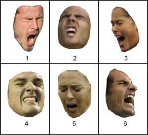
Can you tell who is happy and who is upset?
As an animator I spend a lot of time tweaking a character's facial rig controls into something resembling the emotion I want to portray, but I wonder, just how important is it, compared to getting the body motion working? It may seem a little backwards, since I've been told that people look at the eyes and face of a person more than everything else. There have even been studies done that track where an audience is looking during any particular shot of a movie:
Lots of focus on the face, though obviously in this scene there isn't a whole lot of action going on. I'd be curious to find another example with a lot of full body motion happening.
Still, I suppose the main point is, getting a strong pose may be MORE important than getting the facial expression working. The audience may not be directly focusing on the curve of the spine or the position of the legs and arms, but they "feel" the pose subconsciously and know when something is off, even if they can't quite put their finger on it.
Of course, that's not to say that the face is not important at all. It all works together. But just think of some examples of characters where the face is very simplified or missing all together, and you can still make out their emotions: WALL-E, Luxo Jr., Aladdin's magic carpet, Jack Skellington (no pupils), Gromit (no mouth).
Monday, September 24, 2012
Instant feelings
I've been chuckling over various Tumblrs and blog posts lately, the ones that just collect a bunch of random animated GIFs to represent how the author reacted to certain things (news, a celebrity faux pas, a silly forum comment, etc.). I find them fascinating because they are able to convey a feeling in just a few seconds. I want to start studying GIFs more and analyze what it is about particular snippets of videos that capture the essence of an emotion.
Here's a good one to start:

It features a change of emotion; he starts out pretty neutral, perhaps even a bit bored. His eyebrows are relaxed, his eyelids drooping over his pupils, and his mouth hanging slightly open. Then in an instant you see his brows furrow and lower, his eyes open and dart to the left, then back to focus on the speaker. His whole head tilts a bit in disbelief before freezing in position, facing slightly away from the other guy. Definitely a "WTF?" moment.
There's a lot going on in such a deceptively simple gesture, but breaking it down helps me understand how and a bit of why it works. Unfortunately it also kind of makes it less funny, which I find troublesome. What if I need to animate a funny scene? If I break stuff down to the point that I no longer find it humorous, how will I know whether it's working or not?
Here's a good one to start:

It features a change of emotion; he starts out pretty neutral, perhaps even a bit bored. His eyebrows are relaxed, his eyelids drooping over his pupils, and his mouth hanging slightly open. Then in an instant you see his brows furrow and lower, his eyes open and dart to the left, then back to focus on the speaker. His whole head tilts a bit in disbelief before freezing in position, facing slightly away from the other guy. Definitely a "WTF?" moment.
There's a lot going on in such a deceptively simple gesture, but breaking it down helps me understand how and a bit of why it works. Unfortunately it also kind of makes it less funny, which I find troublesome. What if I need to animate a funny scene? If I break stuff down to the point that I no longer find it humorous, how will I know whether it's working or not?
Tuesday, July 17, 2012
30-Day Drawing Challenge: Day 8

Day 8 is "favorite animated character." I could rattle off my top 20 list easily, but in terms of which character had the most profound influence on me as a budding animator, I'd have to go with Timon.
When The Lion King came out, I was 13 years old and I'd already known for about 10 of them that I wanted to be an animator. Something about Timon's squashy/stretchy body and face really appealed to me, and when I got my hands on the VHS, I popped it into my parents' VCR and frame-by-framed every scene he was in, trying to master his hand poses, facial expressions, line of action, and attitude in my trusty sketchbook.
Looking back on it now, Timon was probably one of the easier characters to draw. Maybe I should have challenged myself more. I tried drawing Simba and Rafiki a few times, but kept coming back to Timon. Of course had I kept up my drawing, maybe I would have gotten good enough to draw any character I wanted! Sadly I'm still not at that level of skill necessary to keep characters on model, do turnarounds, come up with appealing poses, draw from imagination, etc. etc.
When I took an class at the Animation Guild in Burbank, I realized just how much I have to learn if I ever want to become a decent 2D animator. I struggled with every class assignment and was never satisfied with any of my pieces. What would my 13-year-old self say to me if she saw where I was today?
This evening, I popped in The Lion King and sketched out frames from a Timon scene in my sketchbook, just like old times. It's never too late to get back into it!
Thursday, July 12, 2012
30-Day Drawing Challenge: Day 7

Day 7 is our favorite word. This one conjures up so many different and wonderful images in my brain...
Adventure on the Atari 2600 was one of the very first video games I ever played. The graphics were so rudimentary that we couldn't really tell what some things were without the instruction book. Keys and castles were easy enough, but... was that a dragon or a duck? Do you kill him with... an arrow?
Seriously, for about 25 years I'd been picking up the sword the wrong way. You can kill the dragon with either end of it, so I just figured it was an arrow since that's what it looked like to me when I was 5 years old. I don't see how that's any more nonsensical than a plumber eating mushrooms and stomping on turtles. I just had to incorporate that silliness into my artwork. :)
The graphics may have been simple, but for me, it truly was an adventure. It had mazes, secret passages, hidden rooms, terrifying enemies popping out of nowhere, keys to unlock castle gates, and shiny treasure to discover. To this day I still love to play it. I've discovered new games in the interim, one of which inspired the top half of my picture. Sword & Sworcery gave me that same sense of wonder as I took control of the Scythian and got lost in the mountains of Mingi Taw.
Of course, I love going on real adventures too! I have fond memories of growing up and going camping, tidepooling, fishing, and travelling to all sorts of places with my family. Nowadays it's a little harder since I don't get summer vacation anymore. But Tommy and I try to take at least one vacation somewhere new each year.
Ultimately, to me, the very word evokes the discovery of something new, of stepping outside one's comfort zone and being open to experience something that could change your life. It involves risk, sometimes small, sometimes large. I generally prefer the smaller risks. One can have adventures without being reckless, after all :)
Sunday, July 01, 2012
30-Day Drawing Challenge: Day 6
 |
| "The enemy's gate is down." |
Day 6 is my favorite character from a book that hasn't been made into a movie yet. This is soon to change, since Ender's Game is finally being adapted to film after many years of development shenanigans. I figured I'd better draw some fanart now before all the images in my head get warped by the movie. That is, if I decide to see it instead of boycotting it. But that's another matter. Anyway...
So this is the famous zero-gravity battle room. Salamander Army (green-green-brown) has not quite adapted to zero-g, and is attempting to keep themselves oriented the way they were facing in the corridor outside. Meanwhile Ender, decked out in the grey-orange-grey uniform of Dragon Army, has easily reoriented to the position that makes the most sense strategically, throwing himself "down" towards the enemy gate and tucking his knees up to shield him from oncoming blasts.
This image was quite complicated and took a lot of planning and research, but in the end it was quite fun to make. I looked at photos of astronauts, motorcyclists, Tron costumes, and other Ender's Game fan art. Here's some WIP stuff:
 |
| Modelling the background in Maya. |
 |
| Planning out Ender's pose with a temp model. Why does she have such freakishly long legs? |
 |
| Sketching Ender with drapery reference photos. I don't own a spacesuit so I made do with snow pants and a jacket. |
 |
| Rotating the canvas to sketch in Salamander Army. |
 |
| Inks. Had to pull out my tablet laptop since I hate drawing clean lines on a Wacom. It's much more natural to rotate the canvas than to twist my arm. |
 |
| Flat color. After that it's just making stuff look shiny. :) |
The funny thing about Ender's Game is the minimal amount of physical detail given for characters and places - the majority of the book revolves around thoughts and actions. I re-read the book for the zillionth time to see if I missed anything prior to starting my piece, and realized that there wasn't much to miss. I tried my best to compile all the details that I could piece together - red and white buttons on the guns, army colors lighting up the corridor, handholds in the battle room, etc. I wasn't about to draw all 40 kids from both armies though! It was interesting to see how other fans interpreted the book.
The next challenges will not be nearly so involved. But I had to do Ender's Game justice. It helped me get through a difficult growing stage.
Friday, June 22, 2012
30-Day Drawing Challenge: Day 5
Took a short hiatus to work on a Father's Day card and to visit Cars Land at California Adventure (which was awesome, BTW). We shall now attempt to return to our regularly scheduled program!

Day 5: Best Friend -
Well, I had to go with Tommy, obviously... I wouldn't have married him if he weren't my best friend! We love to go on adventures together, usually out into nature like Sequoia or Yellowstone, or in this case one of the little canyons north of Malibu to try to catch the Quadrantids. You know you've found a keeper if he's crazy enough to sit on the hood of the car with you in the middle of winter at 3am to watch for shooting stars. It turned out Malibu wasn't quite far enough away from the city to avoid the light pollution (which you can see glowing out behind the mountain silhouettes, haha)
I was originally going to try to use a simple drawing style for the two figures, something like Pascal Campion does with his work. I don't know why, but it does not seem to come naturally to me at all. Simple design is deceptive! It takes a great eye for line and flow and shape. I guess I need to work on the basics a lot more. Perhaps tomorrow?
Not too happy with the leg positions... I miss Vilppu's figure drawing class. Maybe I will pick up some of his DVDs.
The interesting thing about this challenge is that it gets me thinking about what my strengths and weaknesses are. As I try different techniques, I start to figure out what areas I want to delve more deeply into, to try to explore and hone further. I think this gets back to my earlier blog post about style - it's difficult to develop a style if you don't first know what you want. Must keep drawing and discovering more about myself!
Thursday, June 14, 2012
30-Day Drawing Challenge: Day 4

Day 4 and we're on to "Favorite Place." The choice was easy for me, but picking my favorite part of Disneyland is almost impossible! So many amazing things to do and see. I think what I love the most is discovering all the little details that the casual visitor completely misses. For example, the Evil Queen who occasionally peeks out from behind her curtains, surveying Fantasyland. Even more ominous at night time. :)
I pulled out my pastel pencils for this experiment on black paper. I'm pretty much a newb when it comes to using this medium. I love looking at concept art books and seeing all the beautiful pastel artwork. I know I'll never be as good as them, since I focus the majority of my creativity on animation. Still, it's fun to play around with.
I am so lucky to have a husband who shares my love of the "Happiest Place On Earth." For us that title is especially true, since he proposed to me on the ride right across from the Queen's lookout, Peter Pan!
Got black pastel all over my hands while making those window beams. I love art :D
30-Day Drawing Challenge: Day 3

Day 3: Favorite Food -
My mom's side of the family came to the U.S. after WWII; prior to the Japanese occupation they lived in Hong Kong. Before that my ancestors came from Macau, which was a Portuguese colony with Chinese inhabitants. We have mostly Portuguese genes, but culturally feel closer to our Chinese roots.
Because of that, dim sum is a big family tradition; we go out for holidays, birthdays, whatever. When we were little, my sister, my cousin Jas and I would giggle at the funny Cantonese names for each dish that our parents and grandparents would use to order. Instead of "char siu bao," we would say "char siu POW!!" Ha gow became "hot cow."
Wacom and Photoshop for this one. I also pulled out my handy dandy special effects reference guide, "Elemental Magic" by Joseph Gilland. SOOOOO much good stuff in there. I flipped to the chapter on liquids for ideas on how to do the soy sauce bursting out of Kikko Man's head.
Wacom and Photoshop for this one. I also pulled out my handy dandy special effects reference guide, "Elemental Magic" by Joseph Gilland. SOOOOO much good stuff in there. I flipped to the chapter on liquids for ideas on how to do the soy sauce bursting out of Kikko Man's head.
Tuesday, June 12, 2012
30-Day Drawing Challenge: Day 2

Day 2 is "favorite animal." I had a little trouble deciding between the Okapi and a funky bird called the Hoatzin. They're both fascinating creatures! The Hoatzin chicks actually have claws on their wings and remind me of Archaeopteryx, which is freakin' cool. I'd love to travel to South America and see them hanging out on the riverbanks.
The Okapi are just as strange and wonderful - with those awesome stripes on their hindquarters, they look like a cross between a zebra and a horse. But they are actually most closely related to the giraffe, which you can see from the shape of their head and that long tongue.
I went with my traditional fallback of sketchbook and ballpoint pen for these. Of all the tools I've tried when going on location to sketch, the ballpoint pen seems the most useful to me. They don't need sharpening, you can get light or heavy marks with pressure, the ink is permanent so it doesn't smear on the pages when you're done, and they're cheap so if you lose one out of your backpack or pocket, it's no big deal. I suppose they're not very "professional," but I like them.
30-Day Drawing Challenge: Day 1

My friend Michelle started doing the "30-Day Drawing Challenge" a while back, and I thought it was a really cool idea. Didn't have time to start it myself until after my iAnimate classes were done, but now that they are, it's time to draw!
Day 1 is "Draw Yourself." Kind of a toughie for me. I'm pretty self-conscious when it comes to staring at myself in a mirror or taking photos, etc. So I opted for a simplified portrait and focused on the things that I like to think define me as a whole: my interests, hobbies, stuff I've done, and of course the shirts I wear. I could start a whole blog just about my t-shirts and what they say about me. :)
So for those who may not know me so well, the first three outfits should be pretty self-explanatory: I like video games, I like making art, and I like taking pictures. The fourth outfit with the snazzy green helmet is reminiscent of the typical work gear from my trip to Costa Rica with folks from Playstation and Habitat for Humanity. Finally, the dress is the old uniform from the UCLA and Angeles Chorales, which I used to be a part of before my work got too hectic. I think I've sung Handel's Messiah at least 5 times with them.
Sunday, March 11, 2012
Getty Sketching
I brought my sketchbook to the Getty yesterday and tried out my rusty quicksketch skills while waiting for my friend to arrive. These were some people waiting in line for the tram (click for larger image):


And a slightly longer study of one of the busts in a gallery:

It felt good to be putting pen to paper again. Clicking a mouse doesn't make me feel like much of an artist, at least not in the way that sketching does. I wonder why it's so hard for me these days to open my sketchbook and just draw. Maybe I'll try the 30 Day Challenge that's been circulating Facebook, once my iAnimate class is done.
Saturday, February 25, 2012
A Different Kind of Animation

I've got this subtitle on my blog that says "Running commentary on anything that moves or gives the illusion of movement." Animation to me is more than simply adjusting sliders in Maya or sketching on paper. It's not just about moving things, it's about getting to the essence of things that move you. The best animators are able to boil down the complexities and subtleties of life and people into a focused state, and infuse their work with that essence.
Last week I experienced something that moved my soul. It was animation in the very rawest sense of the word: liveliness, spirit, energy. I haven't yet figured out how to translate it into my artwork, but I am hoping it will find a way. In the meantime, I've resorted to the more mundane medium of writing and chronicled my trip to Costa Rica at my other blog here:
http://pscostarica2012.livejournal.com
I hope you will take time to read it, and reflect on it, and let it animate you!
Thursday, August 25, 2011
Our 3rd Anniversary!
Traditionally each wedding anniversary has a material associated with it (i.e. 1st - Paper, 2nd - cotton, 25th - silver, 50th - gold) and for our 3rd year it was "leather." Well, I'm no good working with leather, but I had an idea of what I could do for this year's gift. Tommy loves baseball, and baseballs are made of leather! So I managed to sneak down to the gift shop during an Angels/Rangers game and procure an official game-used baseball. This year's are pretty sweet because it's the Angels' 50th year, so each baseball has a 50th year logo on it.
Then I set about creating a display to hold the baseball using a material I was more familiar with - Sculpey. :) The tricky part was working on it so Tommy didn't find out! I sculpted mostly at work before and after hours. Below is the finished product along with some WIP pics.


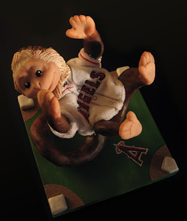


Then I set about creating a display to hold the baseball using a material I was more familiar with - Sculpey. :) The tricky part was working on it so Tommy didn't find out! I sculpted mostly at work before and after hours. Below is the finished product along with some WIP pics.


Tuesday, August 09, 2011
Sketching and style

I was talking with Michelle this evening about "style" - that is, an artist's means of expressing themselves in a unique way that is instantly recognizable to others. The illustrators I like to keep an eye on all have very strong styles that distinguish themselves from other artists. I told Michi that I didn't feel I had a style all my own. I believe it's probably because I don't draw often enough to discover what it is that I find to be uniquely me.
When I do get around to picking up a pencil, I feel a need to study, improve my draftmanship and anatomy, learn about line and color, perspective, appeal, design, lines of action, dynamic poses... then I get overwhelmed and don't feel like drawing anymore. When I was little I didn't care about any of that stuff. Now I peruse other blogs and I get this feeling of inferiority, like I should have tried harder, gotten better. These other bloggers know who they are as artists, they know what they want to say to the world. What is it that I want to say? How can I get "better" if I don't know the answer to that question?
My problem is that I worry too much about drawing a good picture. I have to just start drawing and turn my anxious brain off for a while. That's what I attempted to do above, and I guess I resorted to my old fallbacks, cute "jelly bean belly" creatures and ugly monsters. Is that considered a style? Meh.
There's probably some psychological reason WHY those are my fallbacks. Who knows, perhaps every artist's style is some physical manifestation of their inner psyche. What does it mean when one person has a clean, simple style, while another has a super-detailed, complex and chaotic one? Does anyone analyze sketches the way some people analyze handwriting?
Subscribe to:
Posts (Atom)